Case study with a brand guide, advertising and promotional material. Created with Adobe Illustrator and Adobe Photoshop.
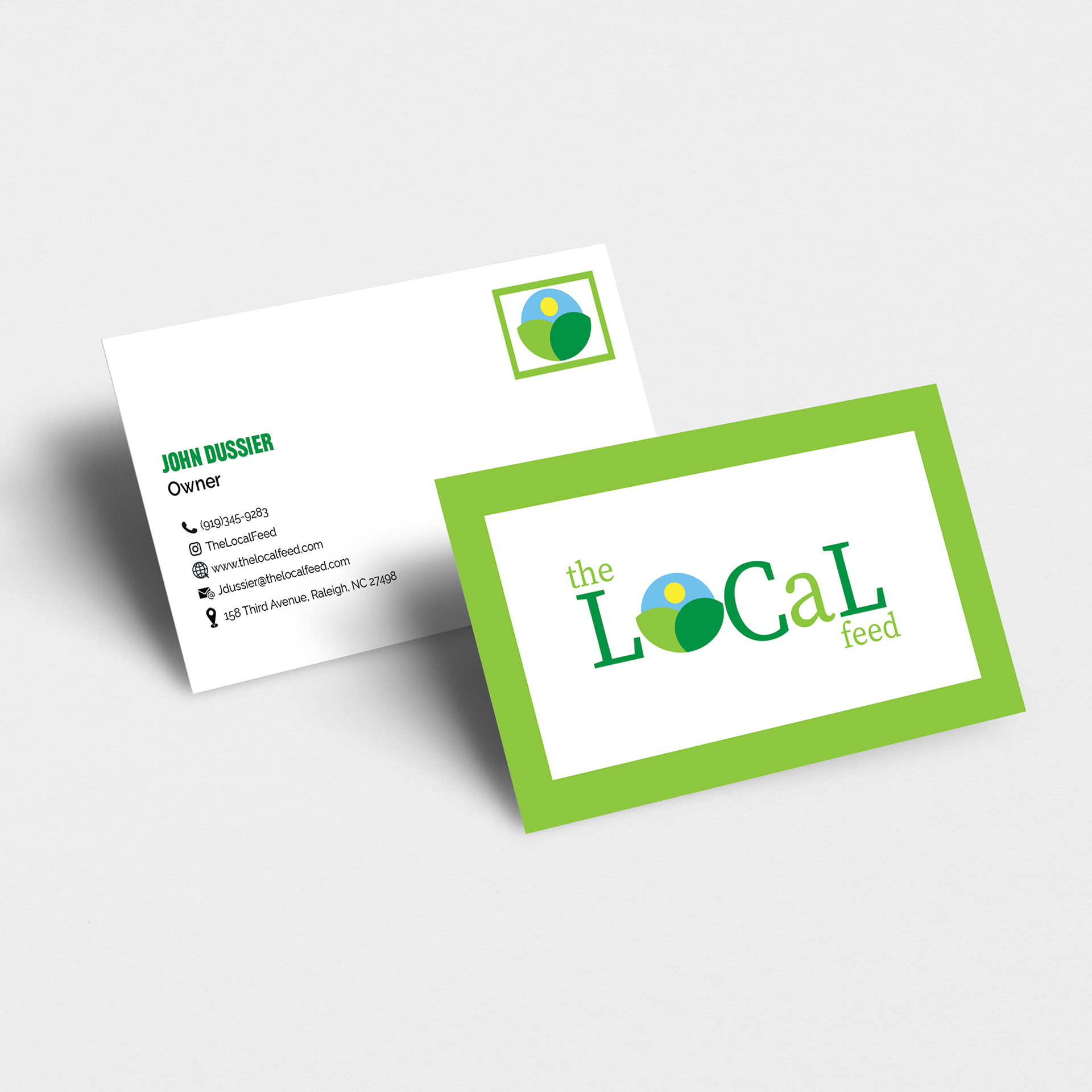
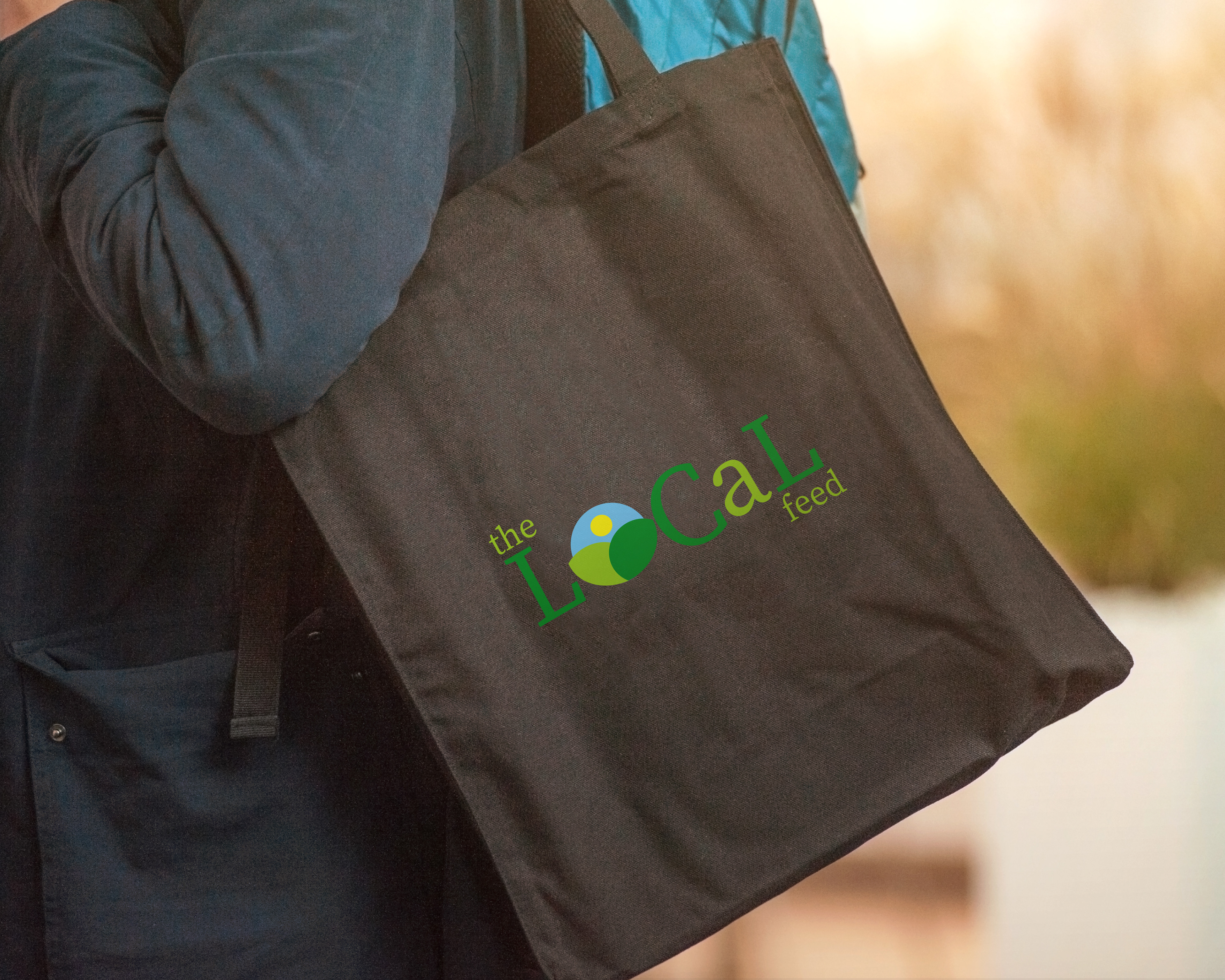
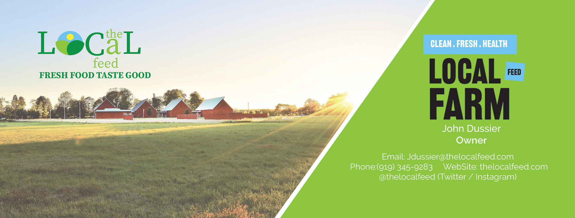
The Local Feed farm in Raleigh, North Carolina, helps you find healthier options. They teach you how to make easy recipes, grow your foods and live a healthy lifestyle. I added for this company was upgrated the logo, made a business card along with a facebook banner for their facebook page and lastly and tote bag for their customers. I wanted this brand to bring more customers that want fresh foods and recipes for their daily lives.
Their core development focuses on simple real-time graphics & home-like summarized as a farm. The current applications on the top advertising the healthy options of those who want to grow vegetables, fruit and more. Its also a community where you share moment learn seasonal recipes to cook.
Through healthy growth, The Local Feed has hired a strong international team with members from 18 different countries to develop their farm in North Carolina.
The Challenge
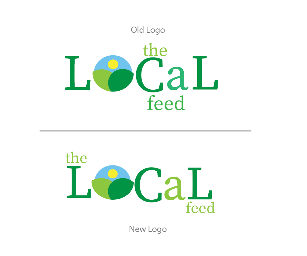
The Local Feed's current logo was very outdated and because they had big plans to grow and expand their business, they needed a new logo that fitted this goal. As some new recipes were created as well, the idea was to use The Local Feed as the 'sun & leaves' main brand, and some of their proud farm to be used as sub-brands. These sub-brands also needed to fit together as a family of logos.
Mindmapping
At the start phase of each of my projects, putting thoughts and key facts about the project on paper is a great way to a wide view of the project and where the possible chances lie.
Brand Guide
Approach
The main importance when designing a visual identity is to get to know the company and the people who work there with much passion and joy. Once I know the company and its people, I dive into the users and their targeting and are using their services. Doing research on specific competitors is important to be aware of, as we do not want to do what others have already been doing. Next to this, I also put together a mood board to determine a visual preference for the client. Putting this all together gives me the opportunity to write out a plan of focus points to start working on my first concept ideas.
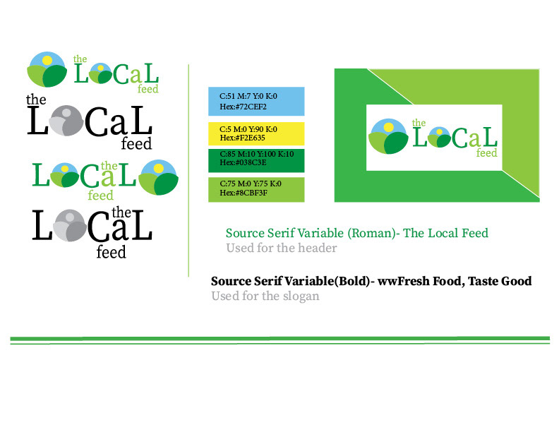
Typography
When it comes to choosing the right typography for a logo, I often focus on what I want to achieve with it. I always look for a font that complements a logo mark. To keep a visual balanced and technical correct, I tend to go with clean and strong-looking fonts. Sometimes I adjust the font to make it fit the identity better. A font family I really love for its strong appearance is Source Serif Variable. This font is a Serif font which is really well to read and easy to customize to fit a brand symbol well.
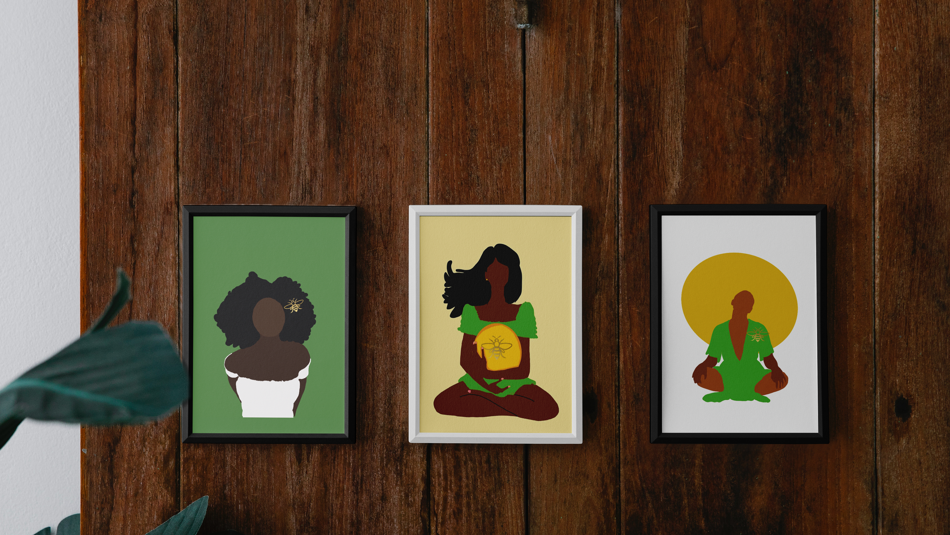
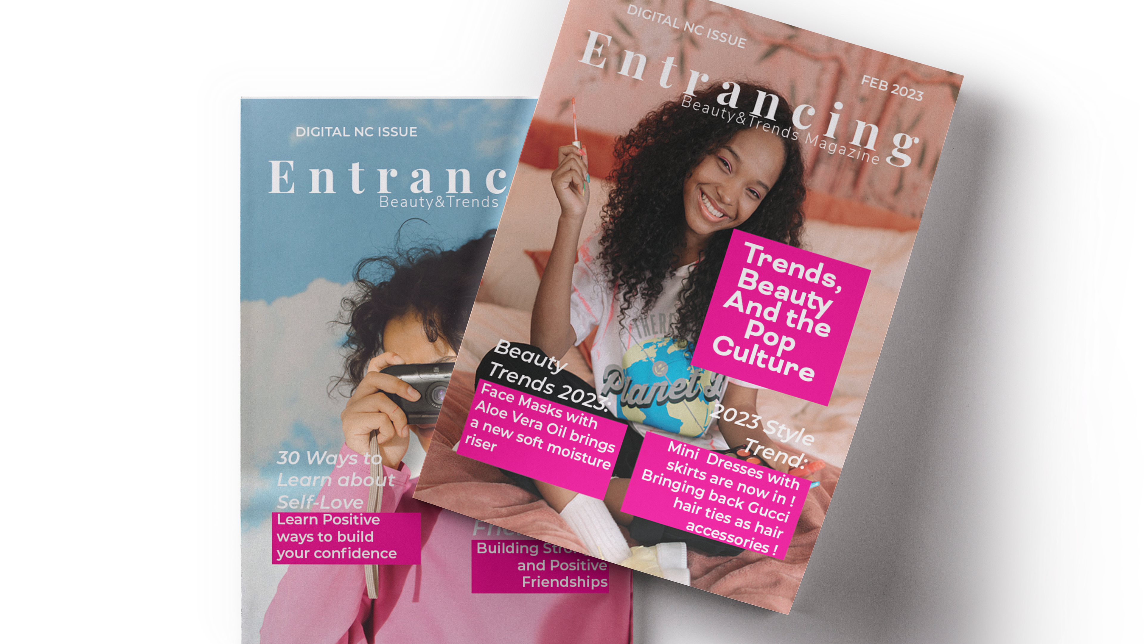
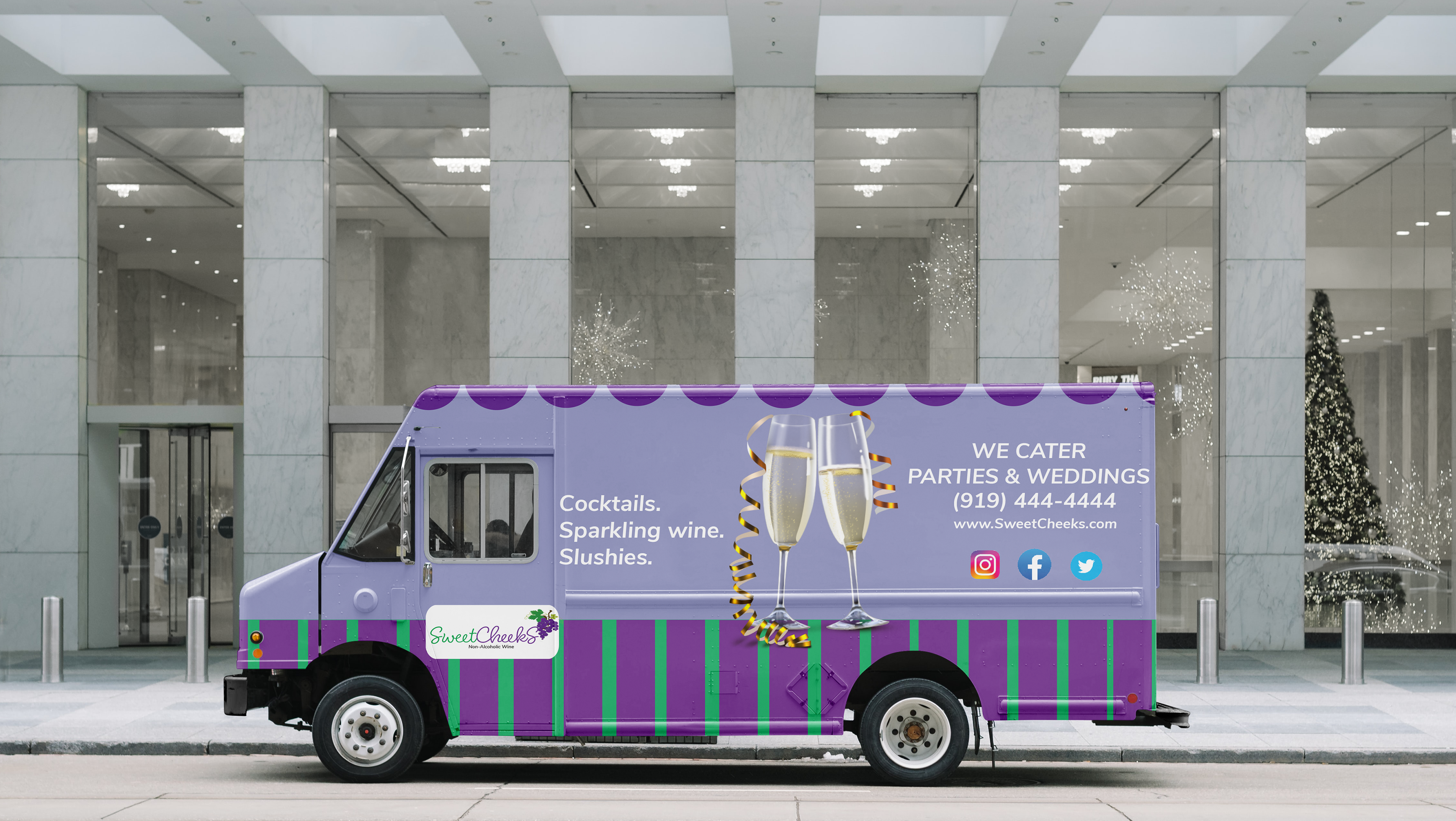
The mock ups
For the mock-ups, I have shown here are updated of how I came up with the details and changed logo in the three pieces I mention in the beginning.